
A landing page is often the first place that someone will interact with your business. It is at the very top of your sales funnel. It can be hit-and-miss, but if done the right way, you’ll be able to rinse and repeat for the next time!
Landing pages are also a great way to get people to sign up for your email newsletter or register for your webinar.
If you’ve created a landing page before and haven’t ended up with many conversions here are some pointers on how to create a landing page that does convert.
Where to start when building your landing page
Great landing page’s have a clear goal and a single call to action. Think about why your target market has chosen you from their Google search, what is it that they want or need?
Landing pages solve a pain point for your target audience — give them an example of something they will lose or haven’t got yet.
Give them a solution that will ease that pain — tell them not just about the product or service but about the benefits they’ll gain from it.
Offer a guarantee — if it’s not monetary make it about satisfaction.
Then the biggie, and I mean BIG CALL TO ACTION BUTTON!
1. How to choose the right structure?
Long-form or short-form landing pages, which is better? It depends entirely on the product or service you’re offering.
Long-form landing pages give you more room to talk about the benefits and add more than one call-to-action (CTA), whereas short-from landing pages get to the point, have all the information “above the fold” and can convert quickly.
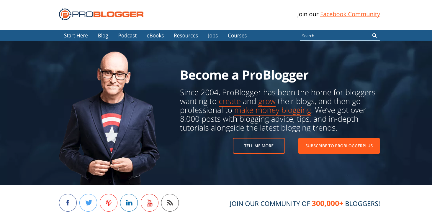
As you can see in this short-form landing page example from Problogger, the CTA buttons are above the fold, meaning you don’t have to scroll down further to get the offer.
Long-form landing pages allow you to discuss the product or service in much more detail but you have to be careful not to bore your audience or you’ll lose them altogether.
Leadpages do this well and why wouldn’t they? They even combine both together.

To maximise conversion rates the trick is to make your copy clear and concise, outlining exactly what it’s all about and precisely what the customer needs to do next. Alethea Tuitahi, Cloud Executive Services
2. Write a killer headline with an explanatory subheadline
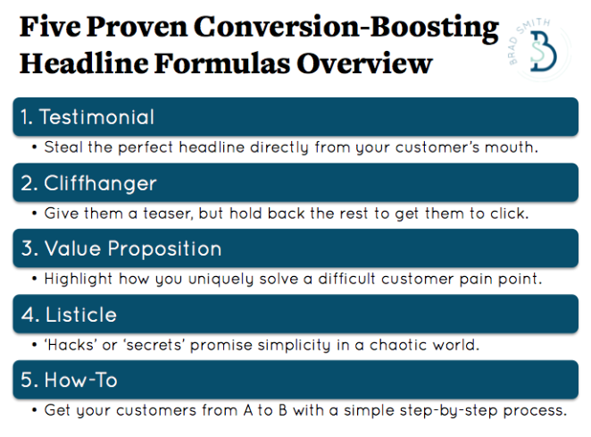
The headline is often the hardest part to get right, take a look at email headlines that really catch your eye and tweak them, write down your aim and all the reasons that someone will want to click on your CTA button.
Creating headlines doesn’t have to be hard, you have to be a bit strategic and creative. Here are some ideas on what type of headlines to write but make sure they’re short:
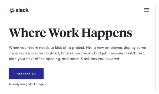
Headlines grab their attention, subheadlines make them want to know more and click that button. Subheadlines are to be written in persuasive language. Here’s an example from Slack:
3. Don’t leave them guessing what it’s all about, make it clear!
It’s no good having people wondering what your product or service can do for them, you need to make it clear.
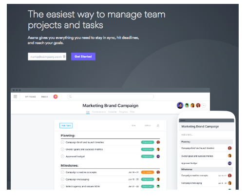
Images are one way of putting an explanation into your landing page, for example, Asana show you what the interface looks like, so that straight away, you think, yes that’s what I need!
Here’s an example of a landing page design from our own portfolio. We created this design for a client around their upcoming webinar. As you can see there is a clear explanation of what the webinar is about and the problems it will solve if you claim your spot now!

4. Let people visualise your offer with images or videos
An image for a landing page is part of the story, it needs to reflect your branding in a big way too.
- The photos you use must be high quality images
- When using an image of a person, have them looking directly at the CTA button
- Use lots of white space, or not, depends on the branding
- Large font is often a better choice
- Adding bullet points makes it easier to read
- Videos increase conversion rates drastically
Take a look at these examples.
5. Add a Guarantee or Social Proof with testimonials or case studies
People coming to your landing page for the first time want some evidence that what your offering is beneficial. Do this by adding a guarantee or some social proof with testimonials or case studies. After all, your already satisfied customers are your biggest advocates.
Positioning your guarantee or social proof close to your CTA will help them decide that they want to convert. Often using a testimonial as the image can have a big effect on hitting that button.
Offering visitors a freebie, such as a downloadable file showing them how to do something or a webinar registration or online consultation, lets them feel appreciated and they’ll gladly give you their name and email address. This will also help them decide if your paid offering is going to be worthwhile, and will influence their decision to convert.
6. CTA
The position of your call-to-action button is critical to converting people to become customers, clients or followers.
Having it above the fold is usually the best spot, making sure that it’s clearly in view, with a large button and large, easy-to-read font.
Use strong, active verbs to influence people to click, for example — book, join, learn, donate, discover. Add a sense of urgency with words like “grow your traffic today” or “be the first to know!”. Include a countdown timer indicating how much time is left until the offer disappears.
Here are some examples from Leadpages of call to action formulas that have seen success:
- Try (product/service) free for (period of time): good for free trials
- Start your free trial now: another free trial option
- Download your free guide/ebook now: promoting downloadables
- Get started now: short, sweet, and versatile
- Order your (product) now: encouraging an urgent sale
- Send me (product/service) now: uses first-person to connect with the visitor
- Learn more: when providing more information in a multi-step funnel
- Get (benefit of service) right now: reminds visitors why they want to take action
- Get your free (xyz): everyone loves something free; this works especially well for a consultation
- Subscribe now: short and effective to gain subscribers
- Talk to us: asking a visitor to reach out
- Get this discount while supplies last: promotes exclusivity and urgency
Conclusion
Now you have a better idea of what to include in your landing page, make sure that it is mobile friendly and if it’s not converting there are some things you can do to change it up a bit.
Performing some A/B testing or split testing will help you understand how your target audience will respond best. Changes can be as simple as changing the colour of your CTA button or the image that you’ve used.
It’s all about the design, so if you’d like some help, book in a call today and we’ll get you started and on the right path.
What’s the next thing you’re going to be offering?
Alethea xo

Alethea Tuitahi
Online Course Designer & Founder
Alethea specialises in creating beautiful, conversional, student focusd online courses. Allowing course creators to deliver their course or program to the world… sans tech frustrations and problems. Need help building your online course? As a Thinkific specialist, Alethea is here to help! Book in a free call here.